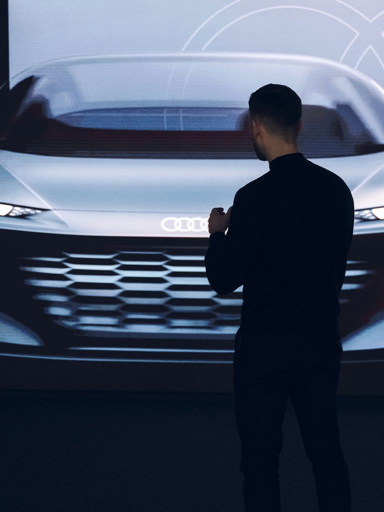
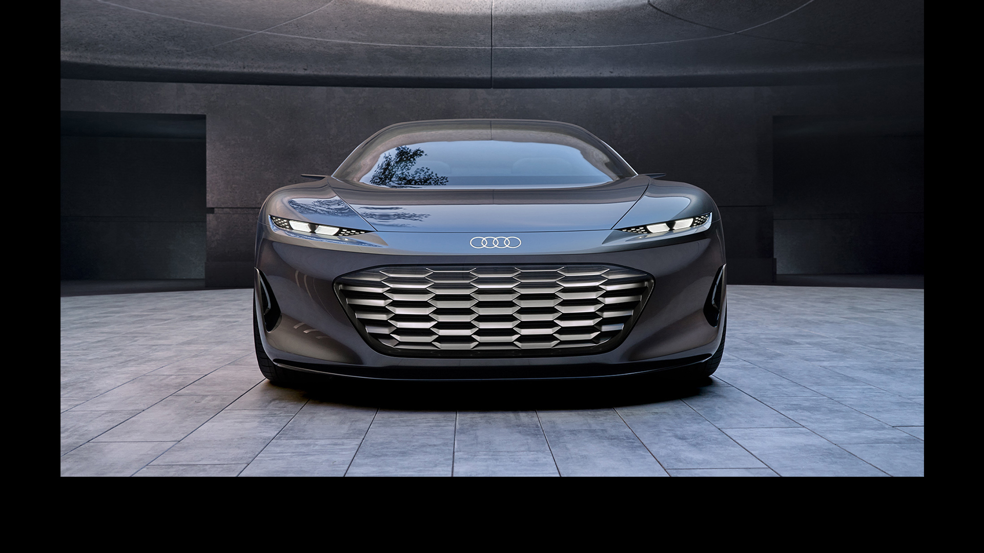
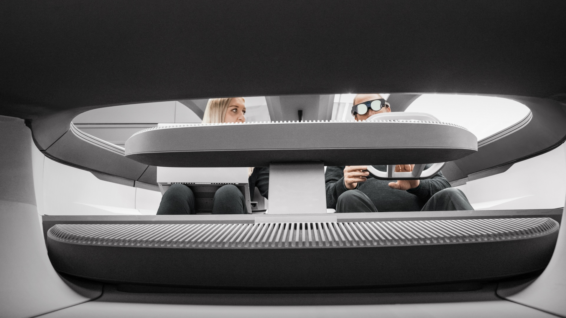
The sphere concept cars not only showcase the iconic new Audi headlights but are also synonymous with the fascinating and immersive worlds of experience.
The Four Rings’ new, luminous gaze.
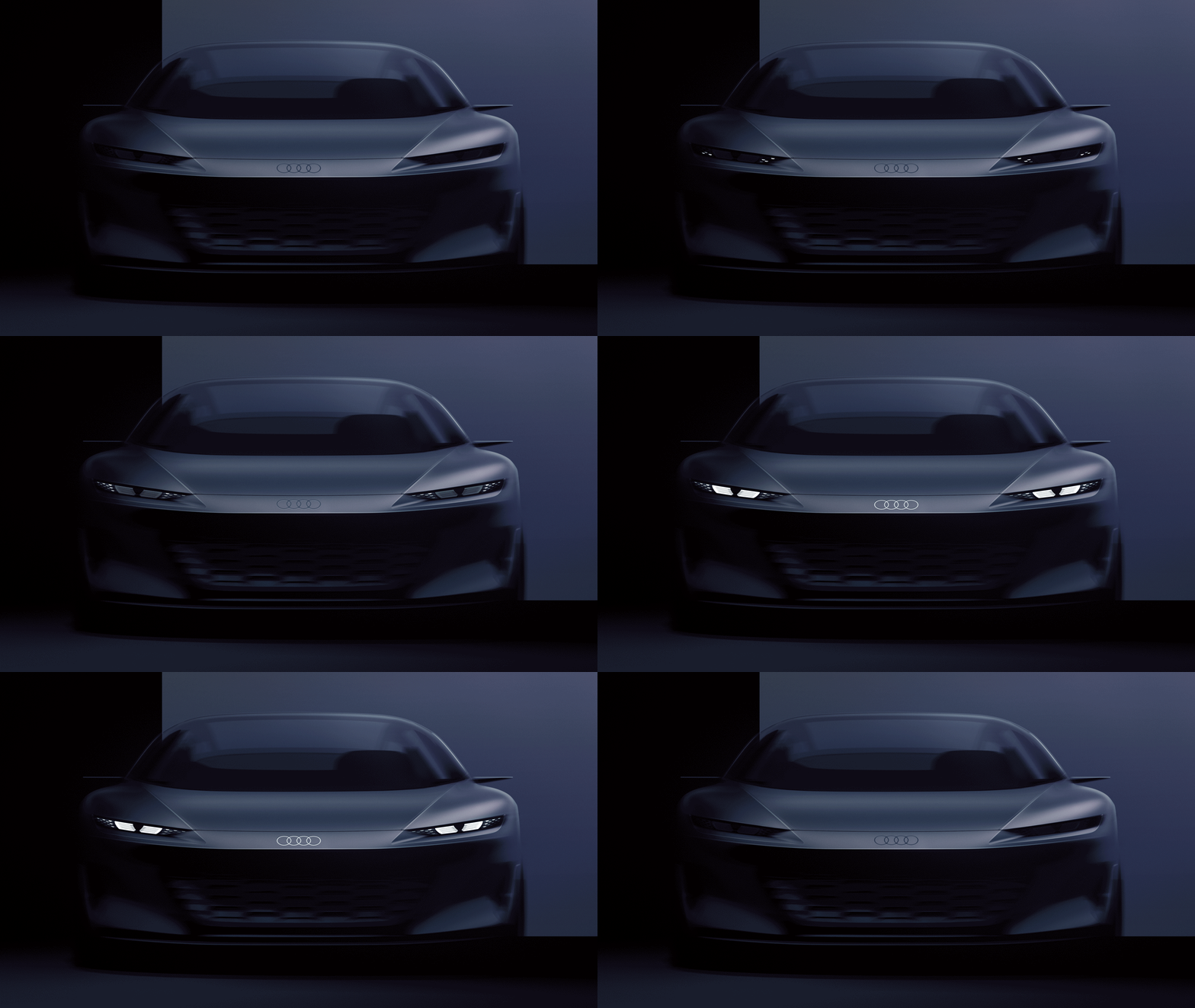
Designer Lukas Rittwage created the Audi eyes – the brand’s iconic new headlights – based on the four rings.
The vehicle shown is a concept vehicle that is not available as a production vehicle.

The vehicle shown is a concept vehicle that is not available as a production vehicle.
The vehicle shown is a concept vehicle that is not available as a production vehicle.
When Lukas Rittwage talks about the Audi eyes he designed, his voice fills with a profound, inner satisfaction – and yes, a good measure of pride. “The pupil in the centre gives the car its focused gaze,” he says, pausing briefly to inhale, as if savouring the thought, “and anyone who looks into the Audi eyes falls under the Audi spell.”
As a member of the Audi lighting design team, Lukas Rittwage was assigned a challenge: Design a pair of minimalist, eye-like headlights that have the potential to become a truly iconic Audi feature. The result? A simple yet striking lighting design element for future vehicle generations. In short, the Audi eyes. They already grace the four Audi Sphere concept cars.
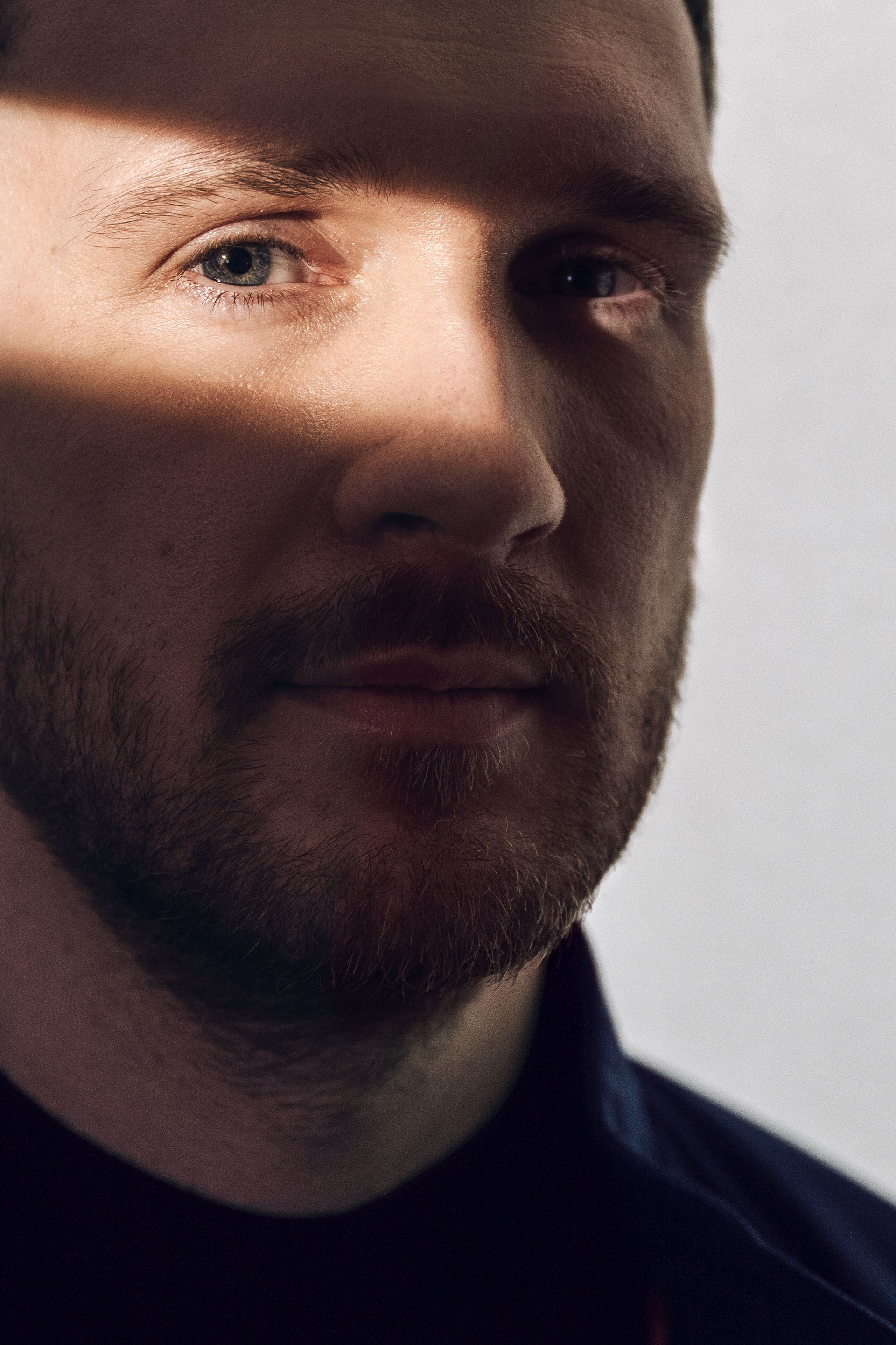
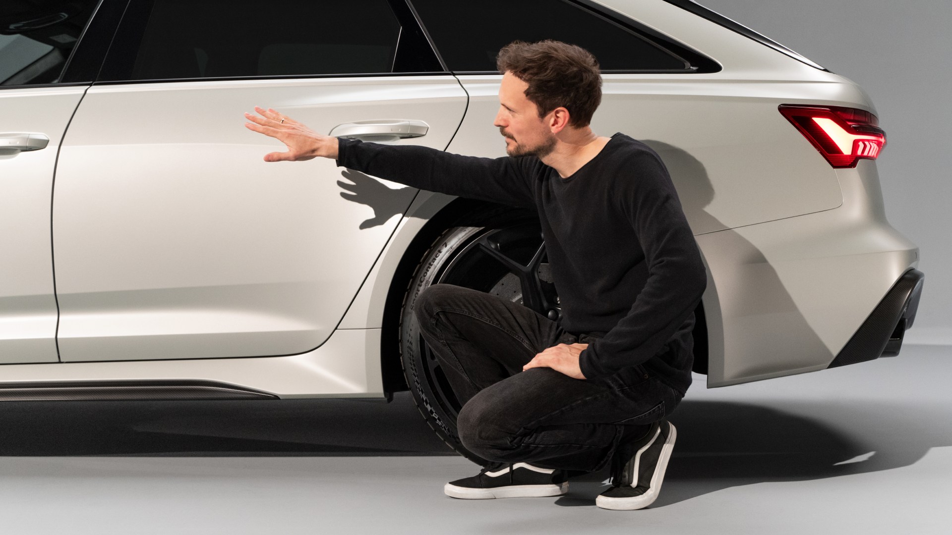
Lukas Rittwage has worked as a designer at Audi since 2015. As a member of the Audi lighting design team, he was responsible for the new Audi eyes.
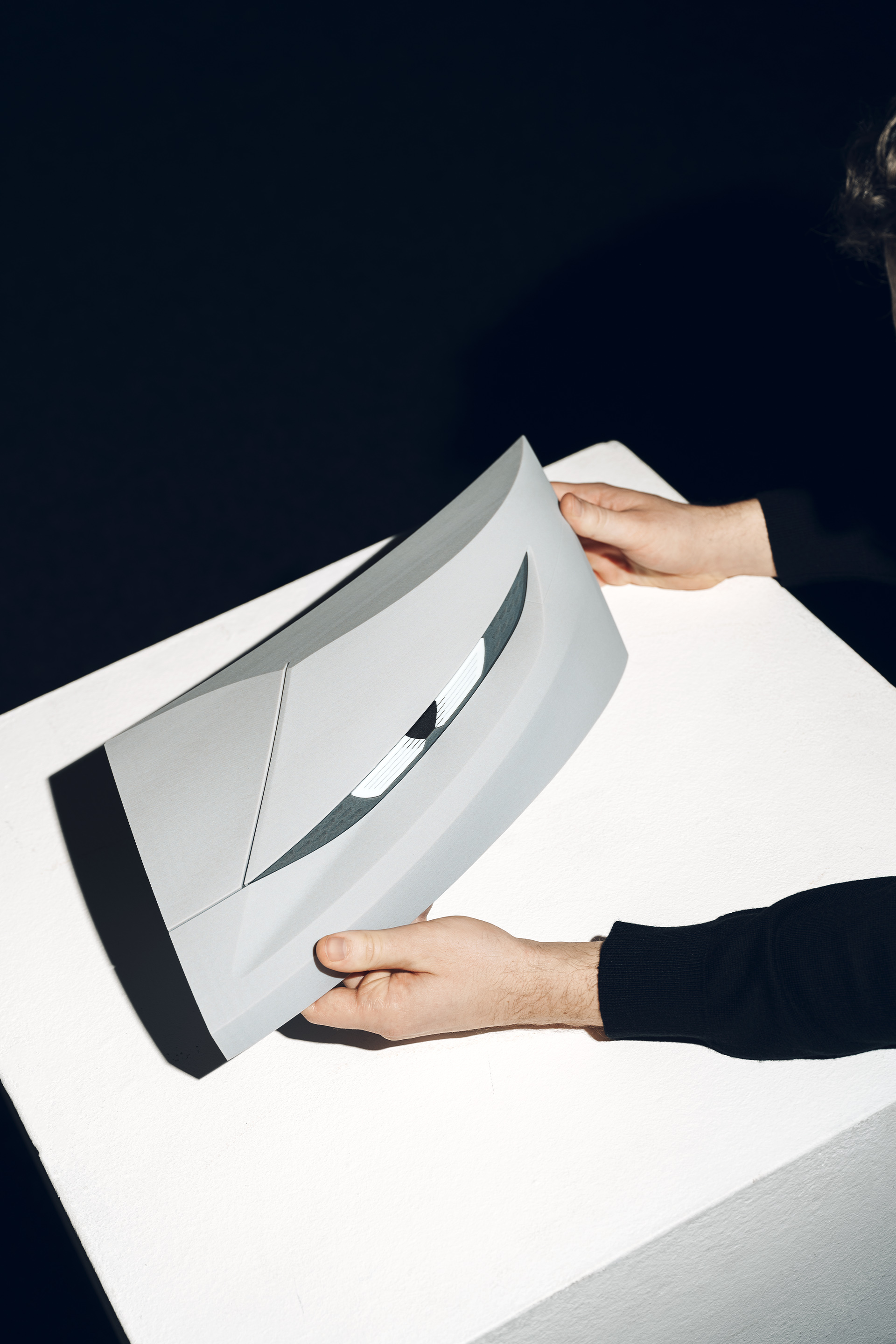
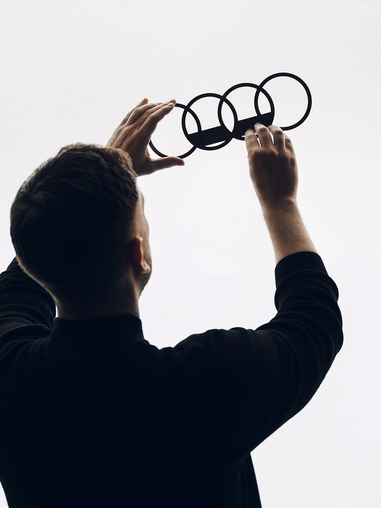
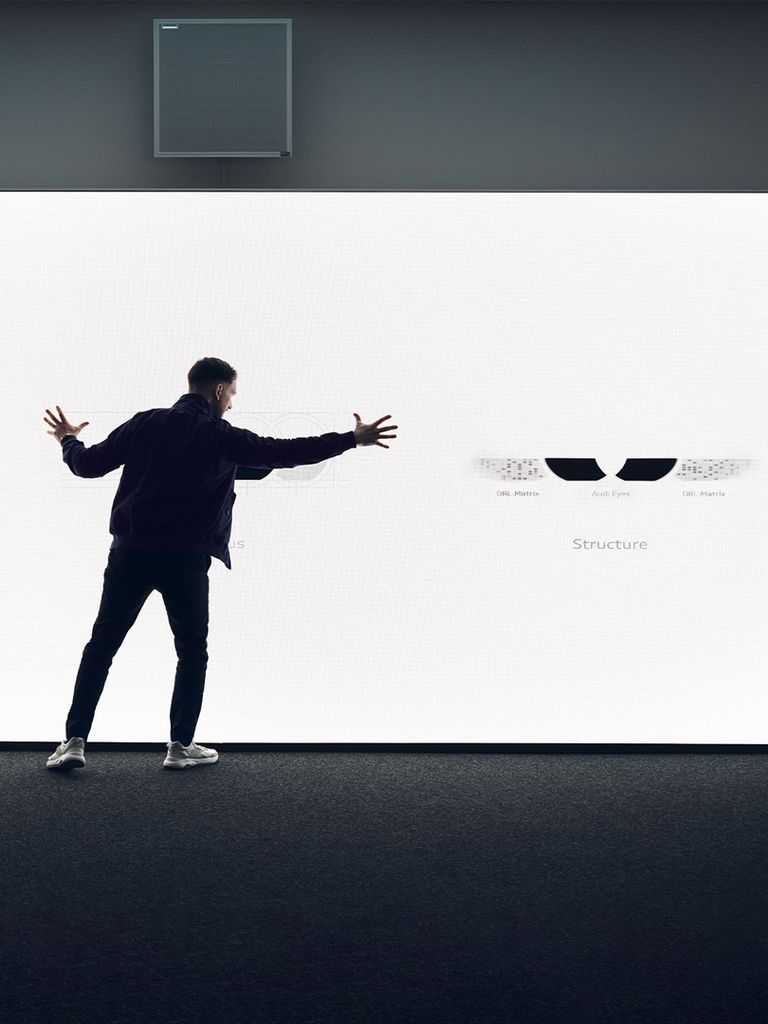
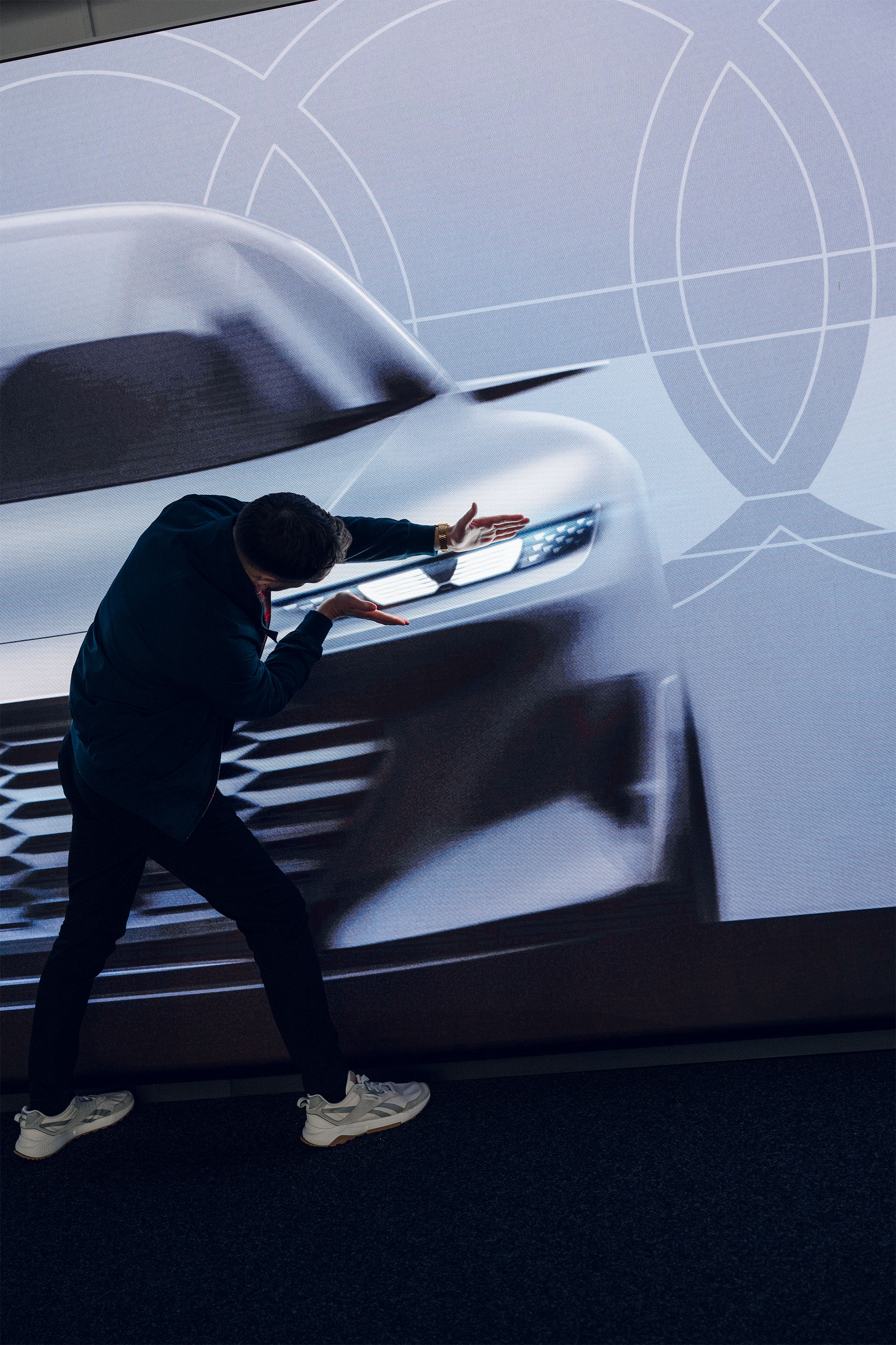
To test how the graphic design fits into the Four Rings’ signature narrow headlight frame, the team used rapid prototyping to create a model of the Audi eyes.
Lukas Rittwage has worked as a designer at Audi since 2015. As a member of the Audi lighting design team, he was responsible for the new Audi eyes.
To test how the graphic design fits into the Four Rings’ signature narrow headlight frame, the team used rapid prototyping to create a model of the Audi eyes.
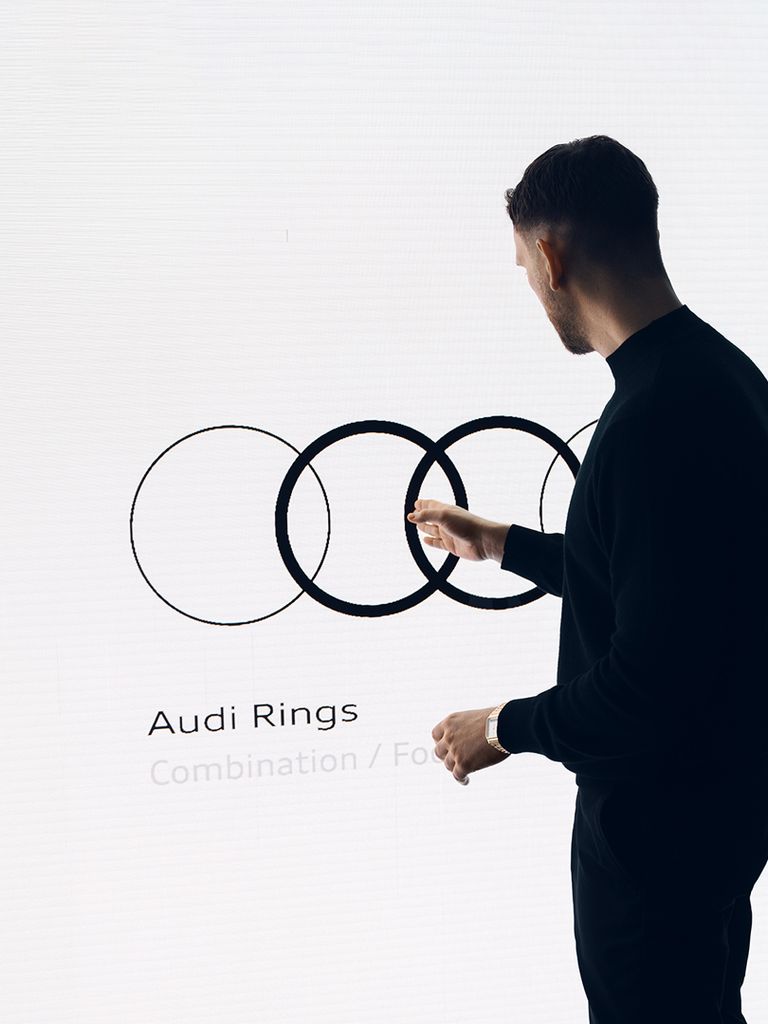
Extraordinary challenges call for ideas to match. Instead of starting with sketches, Rittwage took a different approach: “Right from the start, I knew I wanted to use our brand logo as the basis for the design. That’s because I believe the Audi rings are one of the most striking trademarks in the automotive sector, boasting not only huge recall value but also impressive graphic clarity and power.”
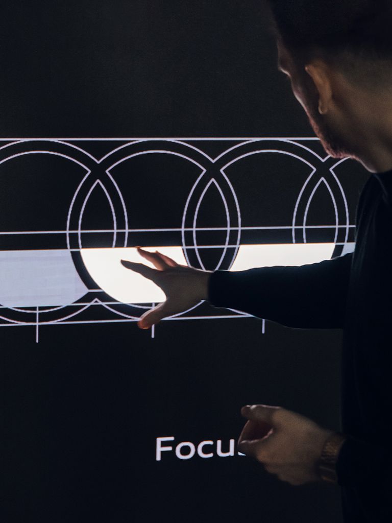
To Lukas’ mind, the Audi logo consists solely of the basic ring shape and the overlaps. Even so, that gave him ample scope and he began to experiment. All the while, he kept asking himself: How do you create something that looks like an eye? By making the two central rings bolder, he noticed that they gained greater depth, projecting into the foreground and popping into focus. And when that happened, a pupil instantly leapt into view. He covered up sections and either fine-tuned contours or focused on areas: “The aesthetic of the Audi lighting design gives us free rein in terms of form, space and lines. I specifically went for a completely new look and feel.” With that in mind, he accentuated the circular areas where the rings intersect. And that’s when the Audi eyes emerged – round areas enclosed by rectangles.
“We always use lighting design to bring out a vehicle’s character and give it a face.”
Lukas Rittwage
The vehicle shown is a concept vehicle that is not available as a production vehicle.
The vehicle shown is a concept vehicle that is not available as a production vehicle.
“Even though I highlight only two rings in the Audi eye, I felt it was important to keep all four rings in my mind’s eye,” says Rittwage. In other words, when the eye is fitted into the lamp, the pupil sits at the centre of the Audi eye but the headlight’s full span corresponds to the length of the Audi logo. The upshot is that the two outer areas provide space for an additional daytime running light as well as coming-home and leaving-home functions.
What makes Rittwage’s approach so successful is that by combining the basic circle shape in the parallel lamps, he kills two birds with one stone. Firstly, when it comes to adding the finishing touches, the design’s flexibility allows for the use of recesses, different mouldings and special details in developing a precisely conceptualised look that gives a sporty vehicle a distinctly different air to, say, a compact class car. When the intersection between the two Audi rings is positioned higher on the horizontal plane, the eye appears rounder and more relaxed. By flattening out the rings’ curves or setting the intersection at more of an angle, he creates a more focused look. Sometimes the pupil is slightly larger, sometimes slightly smaller. Secondly, the eyes ensure that, from a distance, there is no mistaking the distinctive presence of an Audi car. Lukas Rittwage puts it in a nutshell: “It all comes down to the expression that arises from the overall look of the symmetrical headlights when coupled with the Singleframe grille and vehicle’s proportions. We always use lighting design to bring out a vehicle’s character and give it a face.”
The Audi eyes on each model need a unique twist that chimes with the design. In each instance, Lukas Rittwage adapts his iconic headlights to reflect the car’s character.
The vehicle shown is a concept vehicle that is not available as a production vehicle.
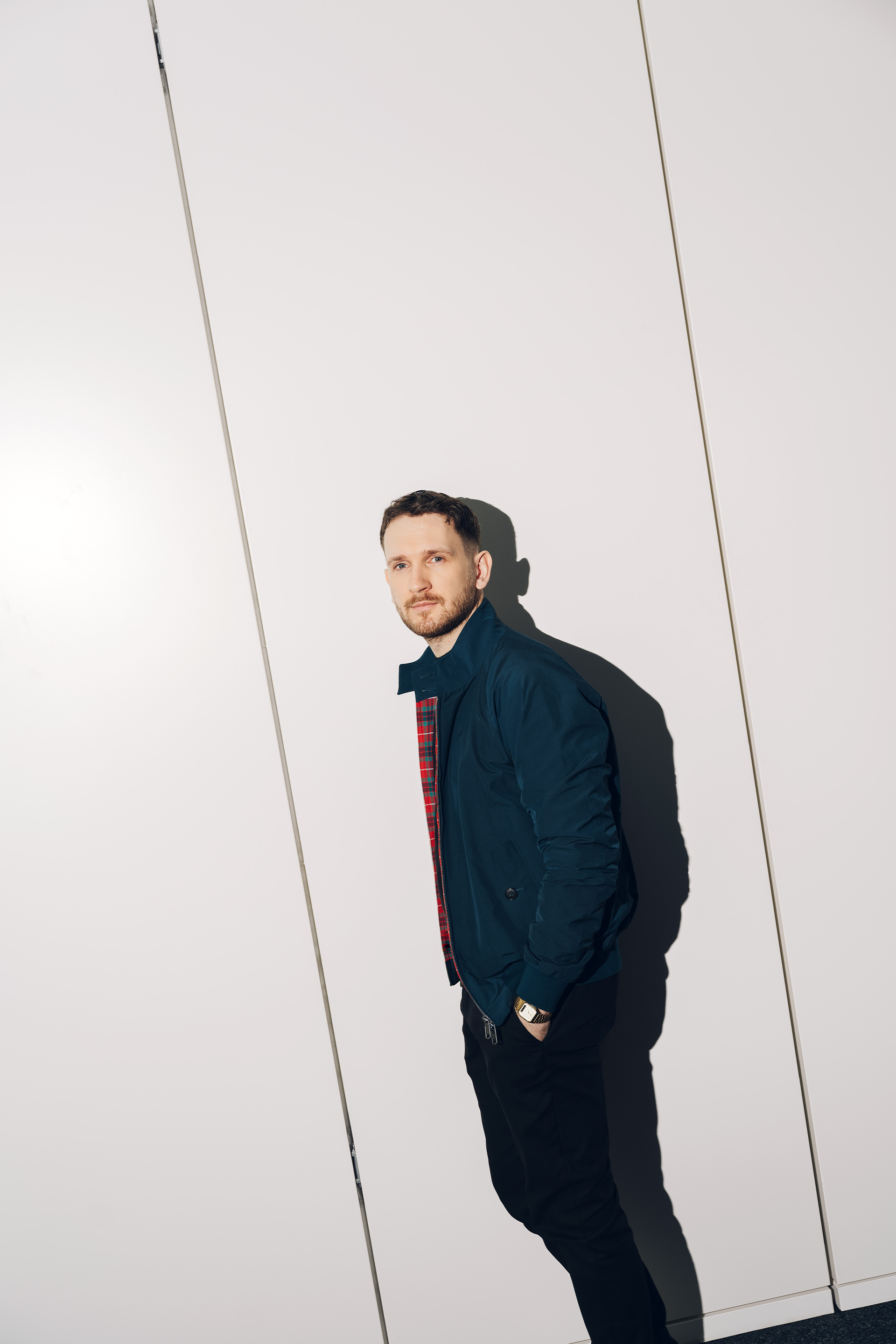
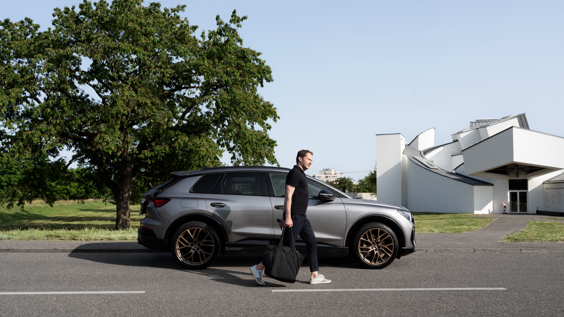
Lukas Rittwage was born and raised in Dessau, Germany, not far from the Bauhaus building. The former school of art, design and architecture is regarded as an iconic piece of modernist design.
The Audi eyes on each model need a unique twist that chimes with the design. In each instance, Lukas Rittwage adapts his iconic headlights to reflect the car’s character.
The vehicle shown is a concept vehicle that is not available as a production vehicle.
Lukas Rittwage was born and raised in Dessau, Germany, not far from the Bauhaus building. The former school of art, design and architecture is regarded as an iconic piece of modernist design.
As a parting shot, the grinning Rittwage shares an anecdote: “For me, Audi has always been the automotive brand whose design best embodied Bauhaus thinking. It’s a design idiom that informs a straightforward aesthetic. When we presented my Audi eyes concept to the Head of Design, Marc Lichte, he said, ‘This is exactly the kind of Bauhaus approach and Audi logic that defines our brand.’ For me, that was the ultimate validation. It was an incredible moment and very emotional. Because I was born within sight of the Bauhaus building and grew up in Dessau.” Once again, we are witness to his profound, inner satisfaction.
